UI/UX Tips from a Developer's Perspective
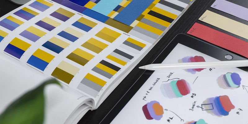
As developers, we spend most of our time in code editors, but understanding UI/UX principles makes us better at building products people love to use.
Spacing Systems
Consistent spacing is the difference between a polished UI and a messy one. Use an 8px grid system — all margins and paddings should be multiples of 8.
/* Good: 8px scale */
.card { padding: 16px; gap: 8px; }
.section { margin-bottom: 32px; }

/* Bad: arbitrary values */
.card { padding: 13px; gap: 7px; }
Typography Hierarchy
Limit yourself to 2-3 font sizes per component. Use weight and color, not size, to create hierarchy within the same level.
Accessibility First
Color contrast, keyboard navigation, and semantic HTML aren't optional — they're fundamental. Use tools like axe DevTools and Lighthouse to audit regularly.
Figma for Developers
Learn Figma basics: auto-layout mirrors CSS flexbox, components mirror React components, and variants mirror props. Understanding this mapping makes handoff seamless.
Key Takeaways
- Use 8px spacing grid religiously
- Fewer font sizes = more professional look
- Test with keyboard only — if you can't use it, users can't either
- Figma auto-layout IS flexbox — use it